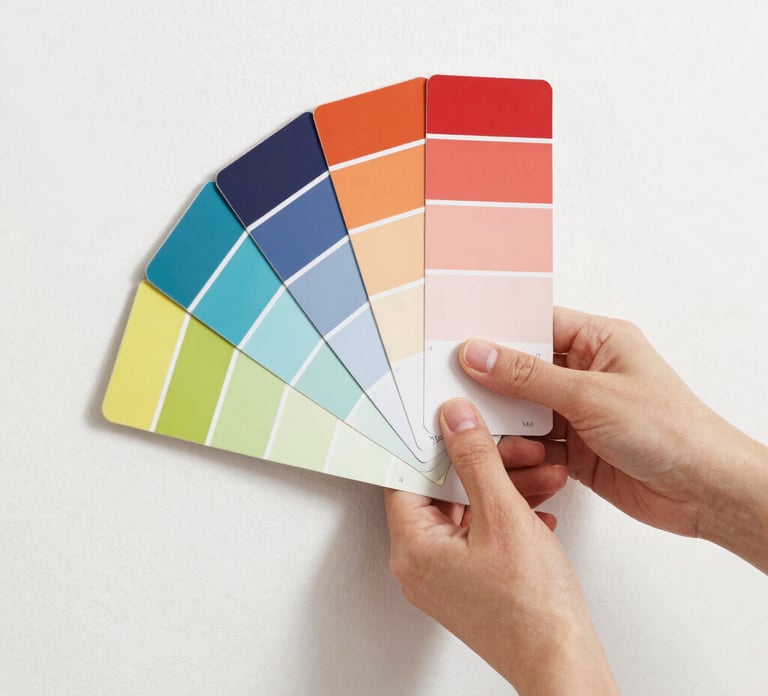
The Right Paint Color
Color is very personal - so making the right decision about what color to paint a room can make or break your dream design.
5/8/20244 min read
How to Choose the Right Paint Color: A Simple Designer's Guide
Choosing a paint color seems easy—until you're standing in front of hundreds of swatches wondering why every white suddenly looks different. The truth is, paint is one of the most impactful design decisions you can make, but it's also one of the trickiest. Lighting, undertones, and your home's existing finishes all influence how a color will look once it's on the wall.
Fortunately, professional paint brands like Benjamin Moore and Behr recommend many of the same techniques interior designers use every day. If you follow a few simple guidelines, you'll dramatically increase your chances of choosing a color you'll love.
Start With What's Already in the Room
Before looking at paint colors, take inventory of the finishes you aren't changing. Your flooring, countertops, cabinetry, tile, and stone all have subtle undertones that should influence your paint choice.
For example, warm wood floors tend to pair best with creamy whites and warm greiges, while cooler gray flooring often looks better with crisp whites or cooler neutrals. Your paint should complement these materials rather than compete with them.
Pay Attention to Undertones
One of the biggest reasons paint surprises people is because of undertones. Nearly every color contains hints of another color beneath the surface—whether that's yellow, pink, green, blue, or gray.
A white that looks perfect in the store may suddenly appear creamy or even green once it's covering an entire wall. Comparing several similar colors side by side is one of the easiest ways to spot these differences before you commit.
Let Natural Light Guide Your Choice
Lighting changes everything. The same paint color can look completely different depending on the room.
North-facing rooms tend to feel cooler and often benefit from warmer paint colors, while south-facing rooms receive abundant natural light that works well with almost any shade. East-facing rooms feel warmer in the morning and cooler later in the day, while west-facing rooms become increasingly warm as the afternoon sun moves in.
This is why Benjamin Moore and Behr both recommend looking at paint samples throughout the day rather than making a decision after seeing them once.
Always Test Paint Samples
If there's one step you shouldn't skip, it's sampling.
Instead of relying on a tiny paint chip, purchase sample pots or peel-and-stick samples and view them in your own home. Move them around the room and observe how they look in both natural daylight and evening lighting.
Paint almost always appears darker and more saturated once it's covering a large wall, so testing first can save you from an expensive mistake.
Choose the Right White
White isn't just white. Some whites are crisp and modern, while others are soft, creamy, or warm.
A bright white works beautifully in contemporary homes, while warmer whites tend to feel more inviting in traditional or mountain-inspired interiors. Popular colors like Benjamin Moore White Dove or Behr Blank Canvas remain favorites because they're versatile and work well in many different lighting conditions.
Think About the Style of Your Home
Your paint should support your home's overall design style.
Modern homes often look best with crisp whites, charcoal accents, and soft grays. Mountain modern interiors typically feature warm greiges, earthy greens, and creamy whites that complement natural wood and stone. Coastal homes lean toward airy whites and soft blues, while traditional spaces often embrace richer neutrals and warm creams.
Choosing colors that fit your home's architecture creates a timeless look that won't quickly feel dated.
Don't Forget About Your Light Bulbs
Paint isn't the only thing affecting color—your light bulbs play a huge role too.
Warm white bulbs between 2700K and 3000K create a cozy, inviting atmosphere and make most paint colors feel richer and more comfortable. Cooler bulbs can make even beautiful paint colors feel sterile, which is why designers generally reserve them for garages, workshops, or utility spaces.
Create Flow Throughout Your Home
One of the easiest ways to make a home feel professionally designed is by creating a cohesive color palette.
That doesn't mean every room has to be identical, but the colors should relate to one another. A warm greige in the living room might transition into a creamy white kitchen and then a soft sage bedroom. Keeping similar undertones throughout your home creates a natural flow from room to room.
Choose the Right Paint Finish
Color isn't the only decision you'll make—the finish matters too.
Matte and eggshell finishes are popular for most living spaces because they provide a soft, sophisticated appearance while still offering durability. Satin finishes work well in kitchens and bathrooms where extra moisture resistance is helpful, while semi-gloss remains the standard for trim, doors, and cabinetry because it's easy to clean.
Final Thoughts
The best paint color isn't necessarily the most popular one—it's the one that works best in your home. By considering your existing finishes, paying attention to undertones, testing samples in different lighting, and choosing colors that complement your home's style, you'll make a decision with confidence.
Paint is one of the most affordable ways to transform a space, but taking a little extra time before opening the first can can make all the difference. When chosen thoughtfully, the right color brings warmth, balance, and personality to your home, creating rooms that feel beautiful no matter the season or time of day.